Redesign is what companies often resort to when something doesn’t go right. New people may enter the office and want the company or the product to bear the mark of their presence. Sometimes brands end up ahead of their time. Sometimes their redesign changes the game for everyone else. Working in a design agency, we’ve seen clients put it all on the line with redesigns and win, but there were those who failed epically as well. We want the latter to never happen again, so here’s the set of traps of redesign and how to avoid them.
Why redesigns fail
Redesigns rarely come unsolicited. Usually, it’s the result of a blamestorming session because of a drop in revenue or a fading hype. Here’s what leads to a redesign decision in most cases.
“We need a fresher look”
Everything goes stale so quick and one of the false ways to go about it refresh the shit out of it just to give a product of a brand a new look.
The problem is it doesn’t end there. Redesigning a menu means changing the architecture and navigation. Every change in the navigation pattern results in changes to the backend. Now all of a sudden it’s not just redesign but an entire product refit. Pimp-my-ride style.
Redesigning for a revamp of the looks is a trap unless you are only changing colors.
Experienced designers say the visual part is the last thing you redesign. In the beginning, there has to be a lot of talking and writing. Doesn’t look like a redesign practice? Bear with me.
“Let’s switch it up”
Every successful app or service has the audience of people that share something in common. Something bigger than the service itself. Ignoring this is another trap. People might not actually feel like what you as the product owner think they do.
Switching it up without having an unbiased perspective of what your users need and want is a risky move. Ask Snapchat. I’m not going to beat the dead horse here, everybody knows the redesign did more harm that the app might never recover from. Snapchat let the popularity grow on them and decided it was the time to move on and switch it up. They thought it was not about what the app could give to people, but about the company doing whatever and keeping a loyal following.
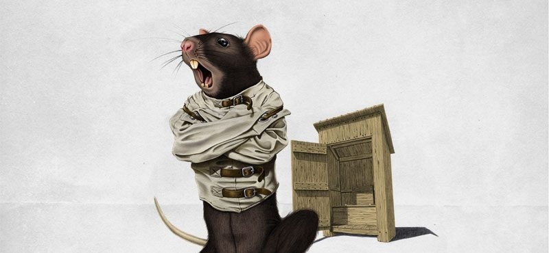
I loved the Walking Dead since the beginning. I gave up after the first episode of season seven. Right after Negan killed Glenn. I felt like it was disrespectful of the show to do that.
Yeah, yeah that’s the point, life is way more brutal. I get it. But all of this didn’t stop me and a lot of people worldwide from giving up on the show. This is an example of a failed redesign.
Redesigning features based on assumptions and previous experience is a trap.
A decision for a product redesign is the result of a research that takes time and effort. It might end up with a negative result but it teaches you plenty of useful lessons about your audience and yourself.
“Gotta blow some smoke”
Sometimes redesign can be a cover-up for other issues like a weak portfolio or weak activity overall. However, these assumptions don’t usually come out of the blue. They are relative to someone and this is a trap. Projecting competition’s numbers on your context without considering all the unknown data is a dead-end track.
This scenario is akin to the arms race. Two countries are competing against one another without having a clear picture of the competition. At some point, this turns into a race against the idea of what the enemy can do rather than what they really can do. This helps no one. People aren’t dumb. They notice deception and they can sniff falsehood.
Redesigning a product to sidetrack attention is a visible sign of despair.
A lot of Asian companies producing cell phones were forced out the market by the rising smartphone. Remember Pantech? Those who stoically took an L and recuperated managed to find a niche later. Those who resisted by pretending they are fine – vanished.
Redesigns fail because they start wrong. Even the coolest visual ideas won’t last unless they are backed by a solid research and delivered on time. Redesign is a team effort starting from the top management. As designers, it is our job to deliver the principles of redesign. After all, everyone should be safe: the user, the owner, and the designers.
The great Instagram rollback of 2018
An example of a weird redesign decision came late in 2018 with Instagram’s horizontal scroll update or a tap-to-advance thing. The update was terrible and people have spoken. In no uncertain terms did they express their resentment in over 30 thousand comments for seven minutes.
Instagram officials called it a “bug” and said they “always trying new ideas, usually with a much smaller number of people…” The vertical scroll made its comeback in an unprecedented hour after the update putting a big question mark above the further development of the popular app.
Due to a bug, some users saw a change to the way their feed appears today. We quickly fixed the issue and feed is back to normal. We apologize for any confusion.
— Instagram (@instagram) December 27, 2018
People have attached their livelihood to social media. Now it’s a new level of pressure on product teams.
Depending on the magnitude of the product, redesign is a strategic move. It’s up to the teams to decide how many users they can sacrifice. Instagram punked millions. We say we can’t let down a single person.
A fix, not a mix
Falling into a trap doesn’t mean you can get out of one. There are redesigns that come out the blue and stay without a dent. That’s because they get in line with something bigger – a cultural shift.
Branding infantilization
It’s hard to trace the origins of cultural shifts but I love Leonid Feagin’s theory on infantilization. Here’s the deal. Love and trust are the feelings that can be chemically induced through our perception organs. Whenever we see something with the attributes of an infant – a round head and big eyes, we secrete oxytocin, the love and trust hormone.
You can’t legally spray oxytocin on people. But you can stimulate it by showing certain imagery. You can sell emotions through things that are constructed to call for oxytocin. This is a cultural shift.

The industry of child products is supposed to only be getting a tiny fraction of money. There are way more adults on the planet. However, child-oriented marketing campaigns are the most successful. Big sugar embraced children as their demographic. There are toy unboxing YouTube channels with millions of views. Adults just need a break. Kids never stop learning, dreaming, and becoming adults. Emotions all around.
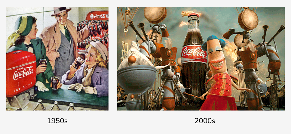
These are the Coca-Cola ads. Spot the difference. The drink didn’t change, the people did. This type of redesign demonstrates the change of paradigm in design. The rules and the attachment to reality no longer matters. Everything is a game. This is a pill of youth for all of us. We are high on oxytocin.
Modern branding is childish symbolism stretched over everything.
We are safe in the environment of our childhood. And when we feel safe, we relax and buy things. We adopt any rules and thrive in them.
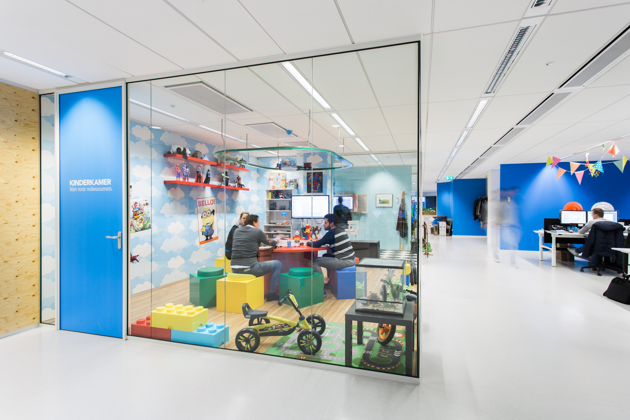
This is Coolblue office. Coolblue is a Dutch e-commerce platform. Are kids even allowed in the office? This office is designed to make you feel relaxed, open, enjoy yourself, and ultimately pass those emotions to the clients.
Redesigning for digital health
One of the most valued commodities in the digital product industry is engagement. Social media made it one of its key metrics. Attention became currency and like any other currency, it started falling in value. People developed a defense mechanism from having their attention kidnapped by products that deserve none. Designers followed up with a cheap shot in dark UX patterns. People replied Don’t @ me. And the whole thing turned really unhealthy.
Redesigns in 2019 have to fix the previous contraptions.
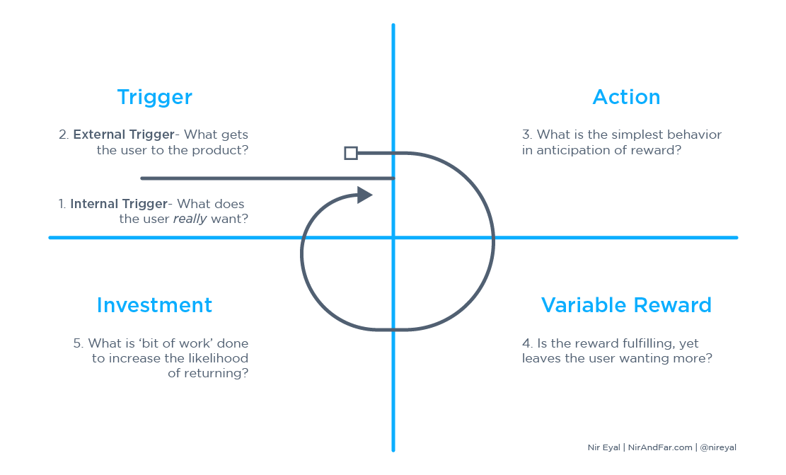
This is a design framework developed by Nir Eyal that can fix the broken pattern of unfair engagement by bringing it back to people. Care and respect are making their way back to product design. A mindful relationship with technology does not need engagement because you are constantly within it.
Modern digital products have to be accessible just like they have to promote digital wellbeing. Through it we can:
- Design to impact the society
- Calm the political turmoil
- Bring out the best in people
- Speak without pitching
- Respect traditions and background
- Decrease the amount of unnecessary technology
Bringing ubiquity
Redesigning a product to bring a healthier experience means thinking outside the conventional interface patterns. Modern design is extremely contextual. People access it through a ton of different devices and the product has to come prepared.
The design that cares and respects leave no people overboard.
Regardless of the Internet connection, screen resolution, and hardware capacity, our job is to bend and twist the product until it satisfies the needs of every single user that comes to you. That’s the ubiquity of an iconic product. Redesigning with this idea can bring a whole new level of problems to deal with but it will also refine the quality of your service.
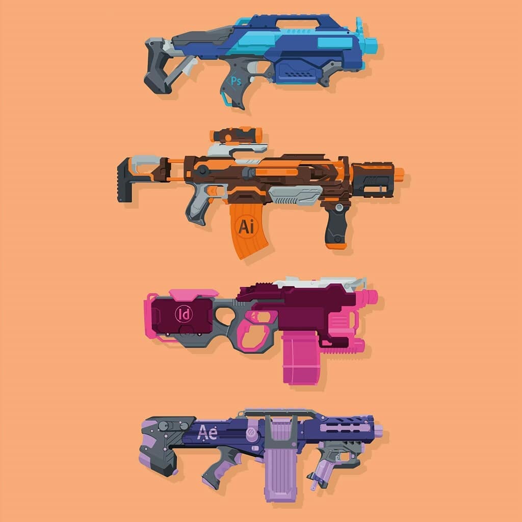
Adobe blasters by perm_art
Big companies build ecosystems of products to protect the user from other companies. That type of service is extremely costly and difficult so only giants like Adobe or Google can afford it.
Smaller companies exist within the ecosystems that users create themselves. This means our products must be just as good and safe as the rest of them to even stay in the league. Redesign, in that case, is strategic maintenance that is as far from “giving a fresh look” as it can possibly be.
To bring ubiquity to a product we must:
- Be hyper aware of the users’ stories and habits.
- Design things in contexts and often contradictions with other products.
- Create states and relations between them rather than abuse the page logic.
Fixing the world one app at a time
If there’s a word more annoying than “toxic”, it’s got to be “disruption”. We don’t need disruption in tech. We need to deal with the problems it got us into. Maybe it’s time to redesign with these in mind:
The three questions we must ask when we are building things
“To what end
At what cost
At whose expense”
Srinija Srinivasan— ~c (@cwodtke) November 2, 2018
In other words, redesign has to make tech work by:
- Fixing the reason why people resist.
- Creating a safe environment to use that technology in.
- Lowering the cost of everything we produce.
- Focusing on respectful improvement of people’s lives, not chindōgu.
My pick of apps moving in the right direction would be Qapital, a banking app that is not about spending but about saving.
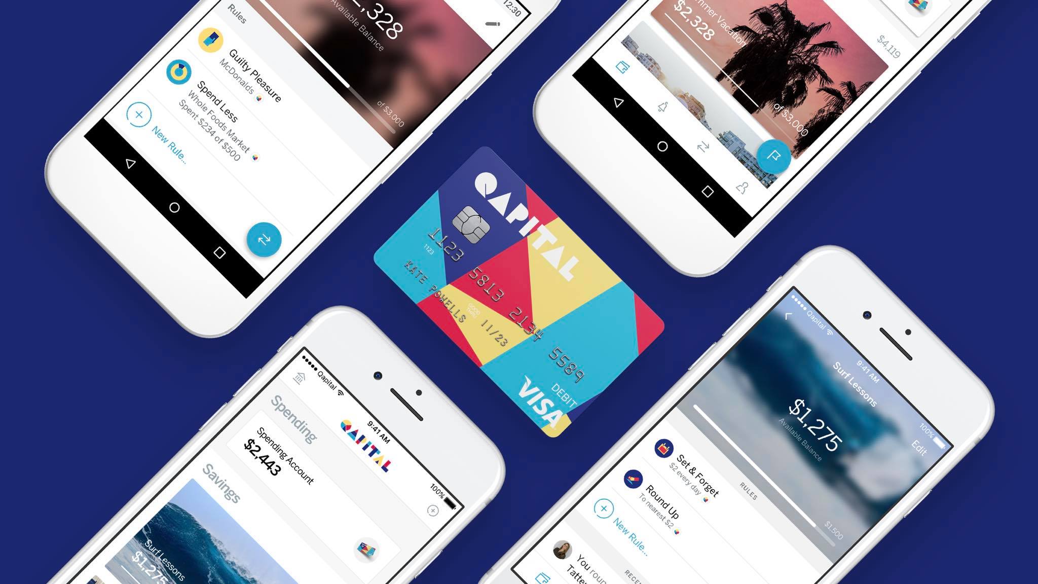
Feeling extravagant because of oxytocin and coffee? Take a look at your progress bars of life goals and be a god damn adult about it. Qapital is about money but it is more so, about people’s lives and the purpose.
Becoming a friend
Fixing the functionality comes in hand with perception. If you sound like a seller, don’t be surprised if people see you as a spammer. If you sound preachy, expect people to do the opposite of what you are telling them. If you are playing tricks on people, they will get back at you hard.
What’s left is being a friend. You won’t hear much adulation from them. But real friends will check you if you are screwing around, and they will go to war for you. That’s what a product must do. Become a friend… or at least sound like one.
Falsehood is the worst thing a product may associate with. And it the hardest to wash off.
Here’s how to spot falsehood in a product voice and description:
- Accentuating money and financial gains.
- No specific details about the product.
- Naked promises of success and fame – “you will be…”.
- Promoted scarcity – “buy now”, “one last left”
- Epithets and reinforced adjectives – innovative, revolutionary, artisanal.
- Unnatural, robotic vernacular.
- Scripted testimonials.
Some people are more susceptible to lies and falsehood than others. They are the reason dirty marketing exists. Being a friend means telling the truth. Redesigning a product must help clean the texts off of all the falsehood. To do that, we have to look deep into the meaning of every copy within the product:
Listen to yourself. If there is something you are not sure in, it will come out as falsehood. The best way to get rid of it is to be real about it. Not sure what the feature does to people? Ask them. Talk to people to unveil the real value of the product and use it to position the product in the user’s realm.
We teach full-time programs in the most requested disciplines of CG art and media. We won’t teach basics here. Our programs skill-specific and backed up by a respective diploma.
Don’t hold back. If you feel like some things you are concealing to protect the business from competition, you are also sacrificing a huge part of trust.
We receive governmental funding but we don’t follow their instructions or any other agenda other than our own.
Use tangible facts to illustrate reality. People resist proofless emotional evaluations of products. Let the people decide if your product really is “innovative”, “disruptive”, or “the best”.
My brother invented this original Hardcore Hammer in 2008. The outer rim protects the recessed milled traction surface that is designed to prevent striking anything but the nail. You won’t need two hammers – Hardcore combines a finish and a framing hammer in one.
The redesign testament
The magnitude of product redesign is huge. It may have various reasons but everything has to come down to a pragmatic evaluation. Redesign has to fix whatever can’t be fixed in the existing design. Simultaneously, it can seriously upgrade the quality of the product and the way it impacts life.
Any redesign is followed by a conversion drop. We have to mitigate that drop by adding more value and utility to the product.
Case: SoundCloud app redesign
Designers flex their muscles by “unsolicited redesigns”. Some find it a waste of time. We believe it is as important as shadow boxing in …boxing. It’s a chance to test your understanding of the process and its purpose from the business owner perspective.
Here’s a SoundCloud app redesign we did because we felt like the service started losing traction because of the competition’s advances. Changes in experience and trust could help.
SoundCloud is an iconic service that discovered a lot of independent artists. Its significance for DIY music is huge but the service needs to stay relevant in the competitive industry. We thought redesign would help SoundCloud become a daily-used music app, not just a connoisseur resource.
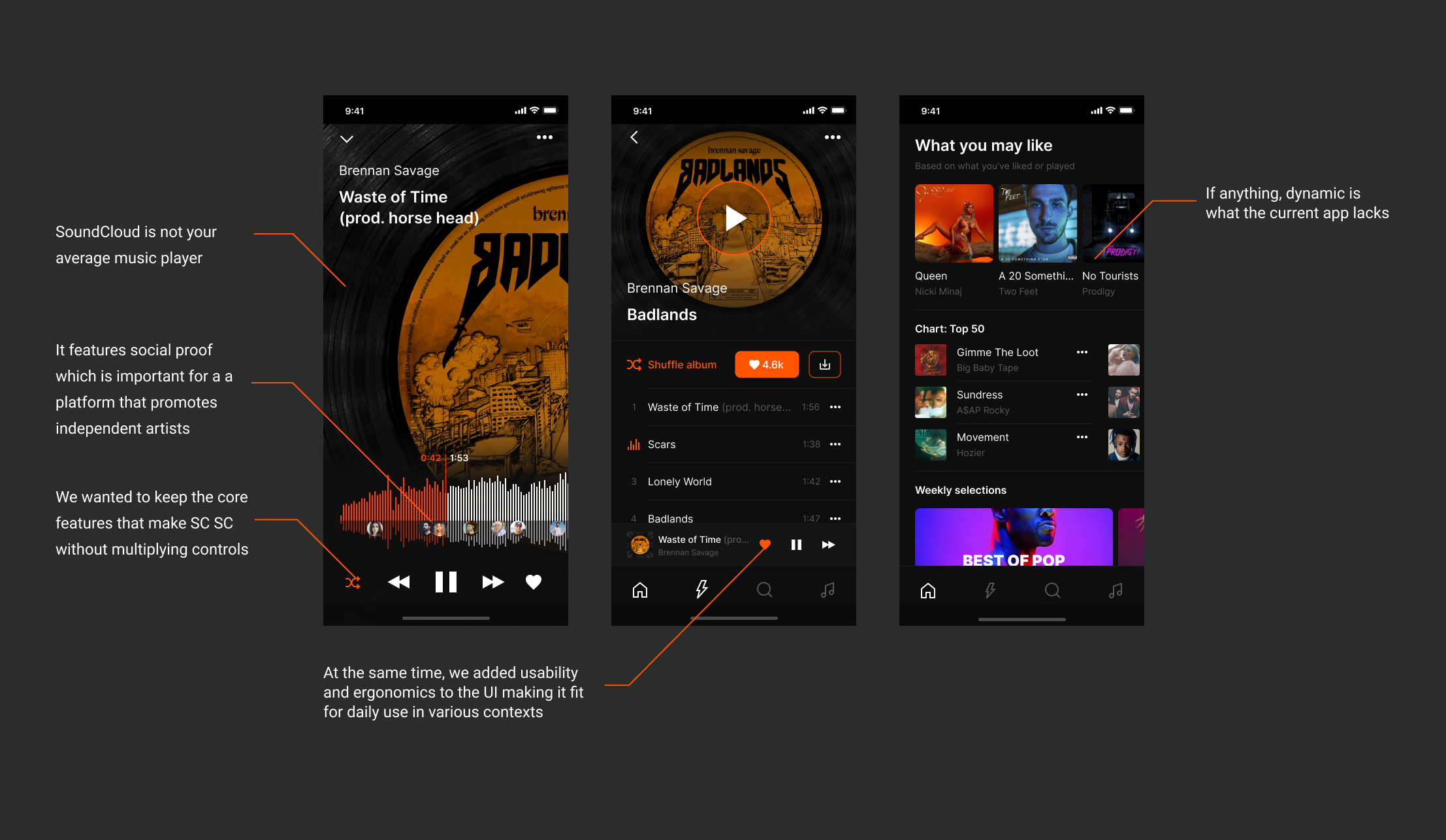
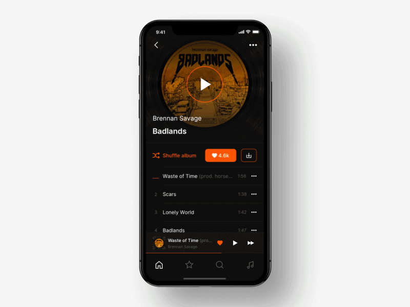
Soundcloud Music App Redesign by Shakuro
