There is science behind every landing page. Marketing targets conversion and uses proven tools to boost it. The traditionally valued parts are headlines, non-distracting images, lists, CTAs, illustrations, and brand voice.
- The headlines have to grab attention and yell at a user its value.
- The images have to either show random people being extremely happy with what they are doing or unrelated scenery that’s supposed to bring a positive vibe to whatever the page is about.
- Lists are supposed to chunk the pile of information you want to put out into consumable bits of important details.
- All of these have to grab the user’s attention and lead them to useful action, thus the CTA.
- To make things a little friendlier, it’s nice to put some custom illustrations in and do all the above in a tone that attributes the brand’s values and maintains the voice that people know.
Considering these is thought to be a recipe for an effective landing page that converts. However, after we’ve worked on two hundred landing pages, we realized it’s not about the construction and text. There are no formal rules for landing pages.
The power of a landing page is in its “onliness”. The depth of this onliness depends on how good you understand the subject.
Illustrate
We put our best foot forward by showcasing our real product. Words won’t sell a product that is misrepresented by weak images. Everything on the promo page has to promote the product in an honest way. We shouldn’t be setting a user up for a specific mood, we are not showing them kittens unless we are designing for a kitten company. The photography has to speak and the text is only a supplement.
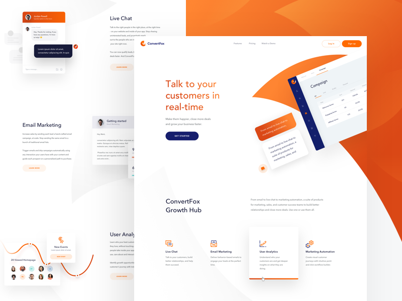
ConvertFox – Homepage by Martin Strba for Balkan Brothers in ConvertFox
This is a service promo page that is rolling in text with relevant information and beautiful vector illustrations. But does it really fulfill business tasks? The company is philosophizing but not showing what it actually does. Instead of saying what we can do and why it is cool, we should engage them in a story with real people and real things. Photography can do that alone. The less we speak, the more we show.
Before a person even makes a purchase we should give them something tangible.
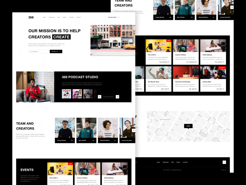
368 Website by Cnosi
Often, designers deprive landing pages of substantial data because it might be confusing when taken out of context. Complex data is a sheer reality that convincingly speaks for itself.
Data can’t harm the page about a product.
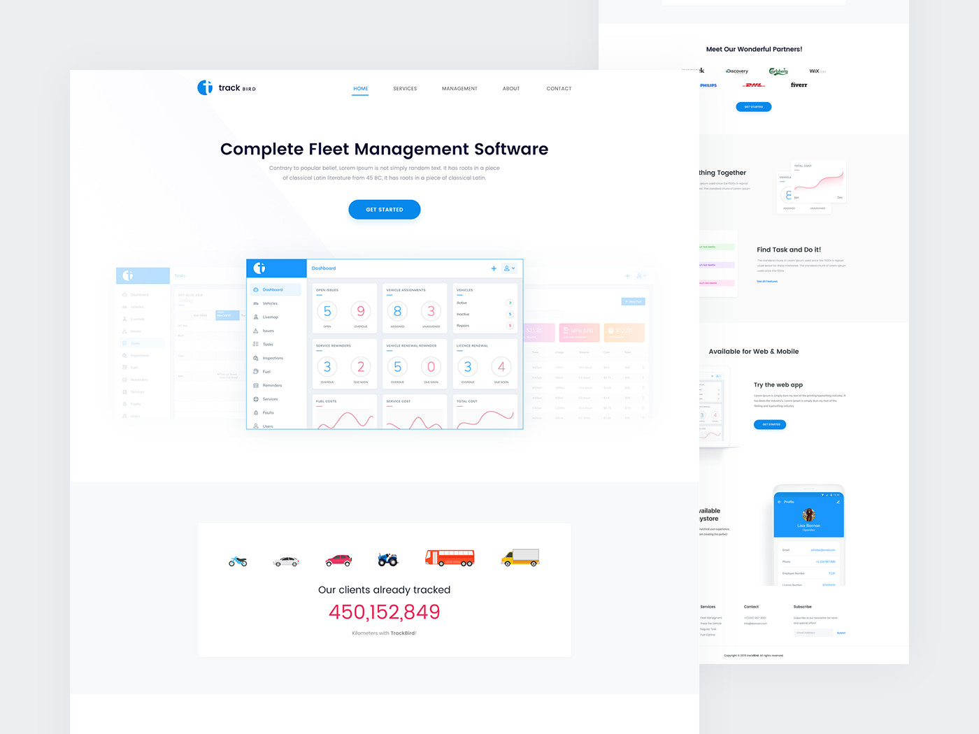
Track Bird – Landing Page for Fleet Management Software by Rikon Rahman
It’s important to make people relate to the content of the landing page. Sometimes we get carried away by our vision and let metaphors flourish. In reality, people relate to other people. Social proof has to be present on a landing page that promotes a product for people. We have to let the people meet in the context of a product.

Foundation Marketplace Founders Page Animation by Zhenya Rynzhuk for Sochnik in Foundation Marketplace
Illustrating is a skill that requires more than just aesthetic feeling from a UI/UX designer. To be persuasive, we have to have a deep knowledge of the product, its audience, and the context of use.
Truthful illustrations safely represent the business and it’s a designer’s job to illustrate gracefully.
Simplify
When designers learn landing pages, they try out a lot of various tools and by trial and error form a set of assets they trust and know best. In the situation where time is severely limited, these assets are a lifesaver. With time the experiments stop and regardless of the subject matter, the form begins to dominate and the cookie-cutter design comes into play. This does not mean it’s a bad thing.
Consistency is an advantage for any business but consistency can’t be played by rivals.
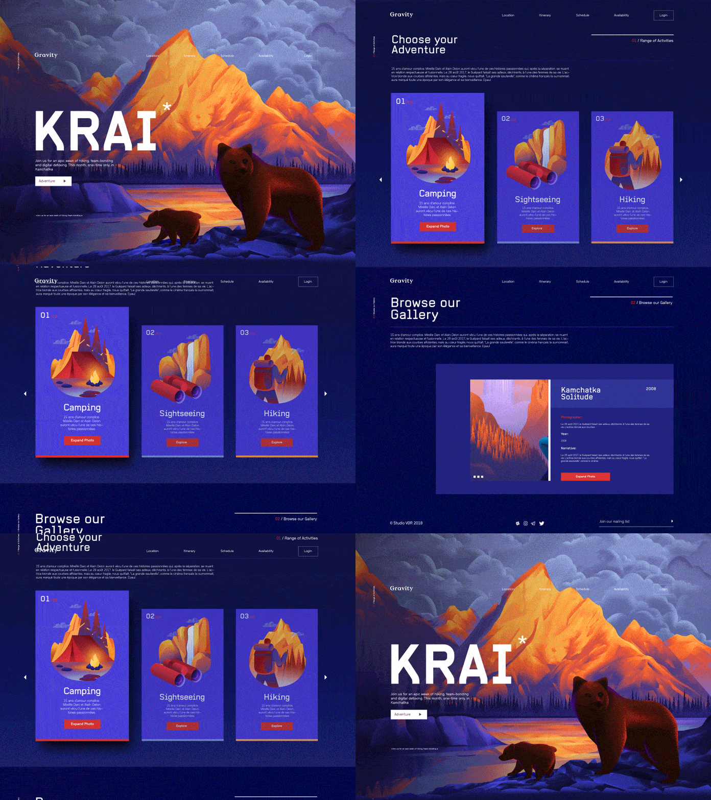
K R A I by Zak Steele-Eklund for Studio VØR
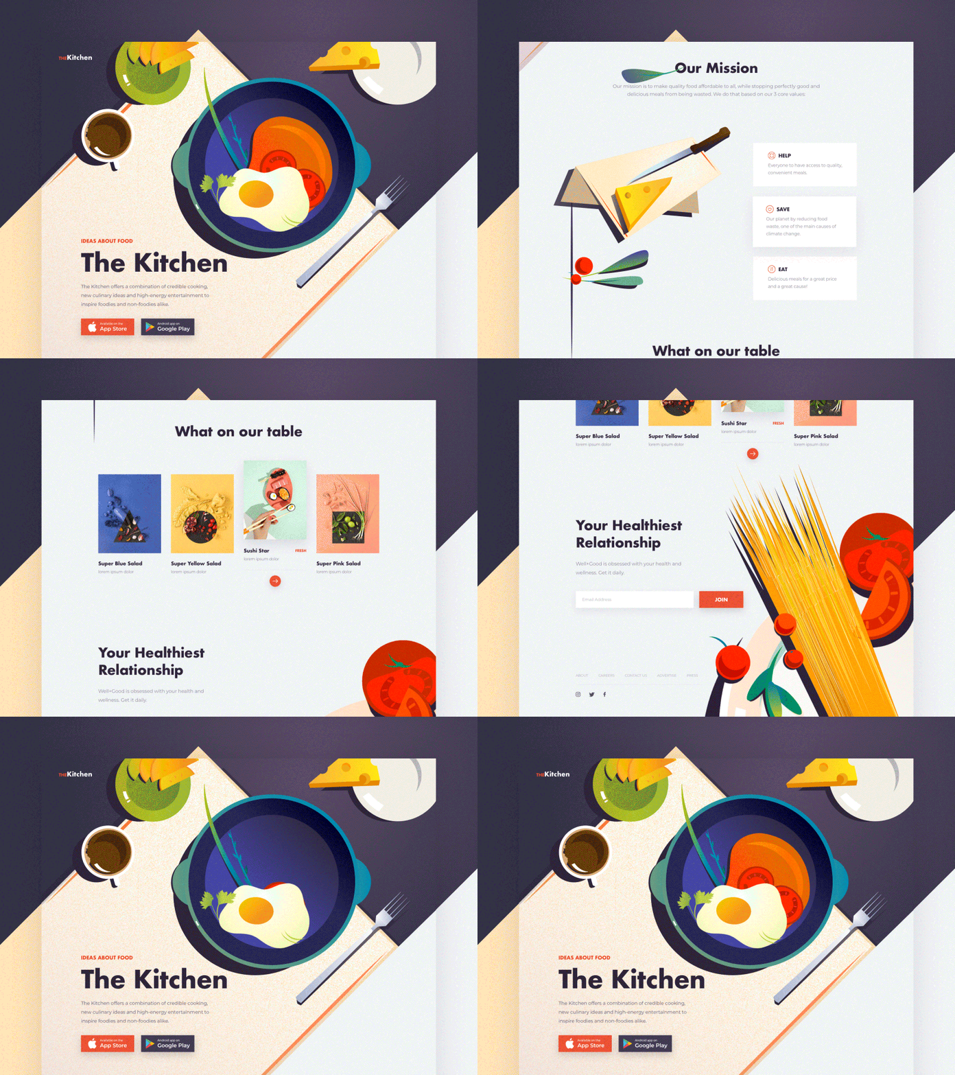
For all food lovers by Outcrowd
The illustrations work as a background for what’s in front. And in front, it’s usually a bold statement, and some proving points are usually grouped in columns of three. When the web design loves itself, which it has the right to do, and with no context of use, it works just fine.
The question is where are the user and the problem they’ve come to solve? Usually, the text addresses those problems but once put in columns it becomes difficult to read. To fix that, they use icons that metaphorically convey the meaning of the text in the column. Writers hate columns. Placing text with no hyphenation breaks the width of the column and changes the wording. People read the columns the same way they do paragraphs – left to right. A metaphorical icon does not add meaning but can easily add confusion. When the text is short, it should be clear without an icon dubbing the meaning.
Instead of the columnized structure, we should use meaningful images proving the significance of whatever you were putting into those columns. Any advantage or feature has to be provable by real-world evidence.
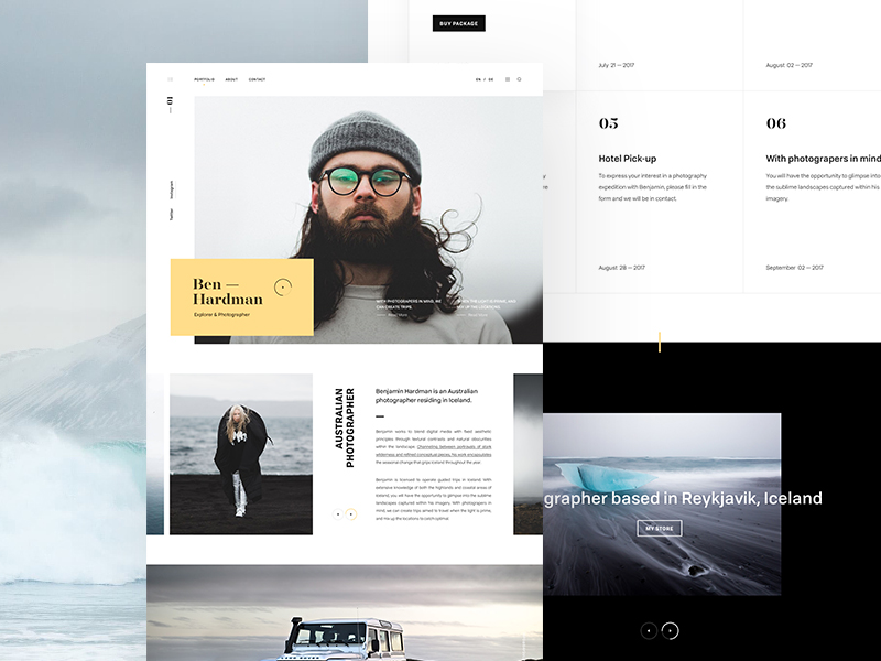
Ben Hardman by Andrew Baygulov for Revølve Studio
The text on the landing page has to contribute to the usefulness of the product from the perspective of a user. To highlight the key points, it makes sense to use theses that are clear and truthful. A fact check should not be feared. We hid the technical features inside the red dots without cluttering the page.
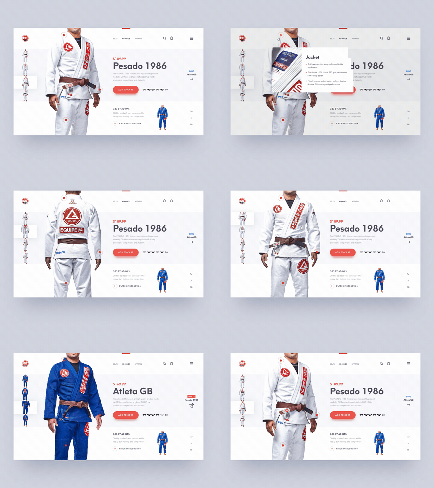
Jiu-Jitsu Gi Shop Product Animation by Shakuro in Web Design
Here, we demonstrate the product, appeal to the aesthetic but also address the fact that this is a practical product. What’s left is to add real images and context of use that people can relate to.
Exemplify
Website landing pages are filled with abstract statements. To make a transition from abstract to concrete, we have to demonstrate reality. Whether it’s subjectively good or bad, it’s important to give a user a full perspective of the product.
For a UI/UX designer, it’s quite a task because the client wouldn’t want to mention what may harm their business. However, you can run the bait and turn a problem into an advantage. If there is information you need to hide, tell up front why it goes wrong and how to avoid it.
Examples convert, not promises.
Whenever you feel the urge or are contractually obliged to give an inflated speech on the landing page, always think about what it would mean for a stranger. They don’t know you are cool and they don’t care. What they care about is whether you can help. Put out examples of your help.
- A VR promo page says: “The future is now.” I don’t know but to me, the future is flying cars and 1000 ft. tall buildings. For someone it’s cyberpunk. How does the VR take you to the future? Show the things it can improve your life with right now. For example, “Play basketball with Kobe on the Moon.”
- A recruitment page says: “Build powerful connections with rising talents.” What is a powerful connection and how does it help a company? Who’s a rising talent, the one with zero experience? It’s a perfect place to exemplify with real data: “Our every candidate gets hired within the first three months. If it takes longer – we pay them.”
- A development utility landing page screams: “We will power your success.” Do you really think everyone is successful or do you just have low standards? What if they fail while using a tool? Do we power their failure too? To focus on the good thing, it should be more like: “We cut the compile time of Linux kernel to 15 minutes.”
- A traveling website says: “Experience Your World.” I wish I could experience someone else’s. What is there is the world worth seeing? Isn’t this what people come for? Why not give them some: “Lagoons in the Lençóis Maranhenses National Park. $600.”
- A separate subject is words like “best”, “most”, “innovative”, “disruptive”, and “artisan”. Authors use them because they sound strong but are impossible to pick on. How do you prove you are the best? Compared to whom and who’s to judge? There is zero useful information in these and zero care.
Regardless of the type of product or service, you are designing for, there have to be real-life examples attached to the user. The product has to be able to speak for itself.
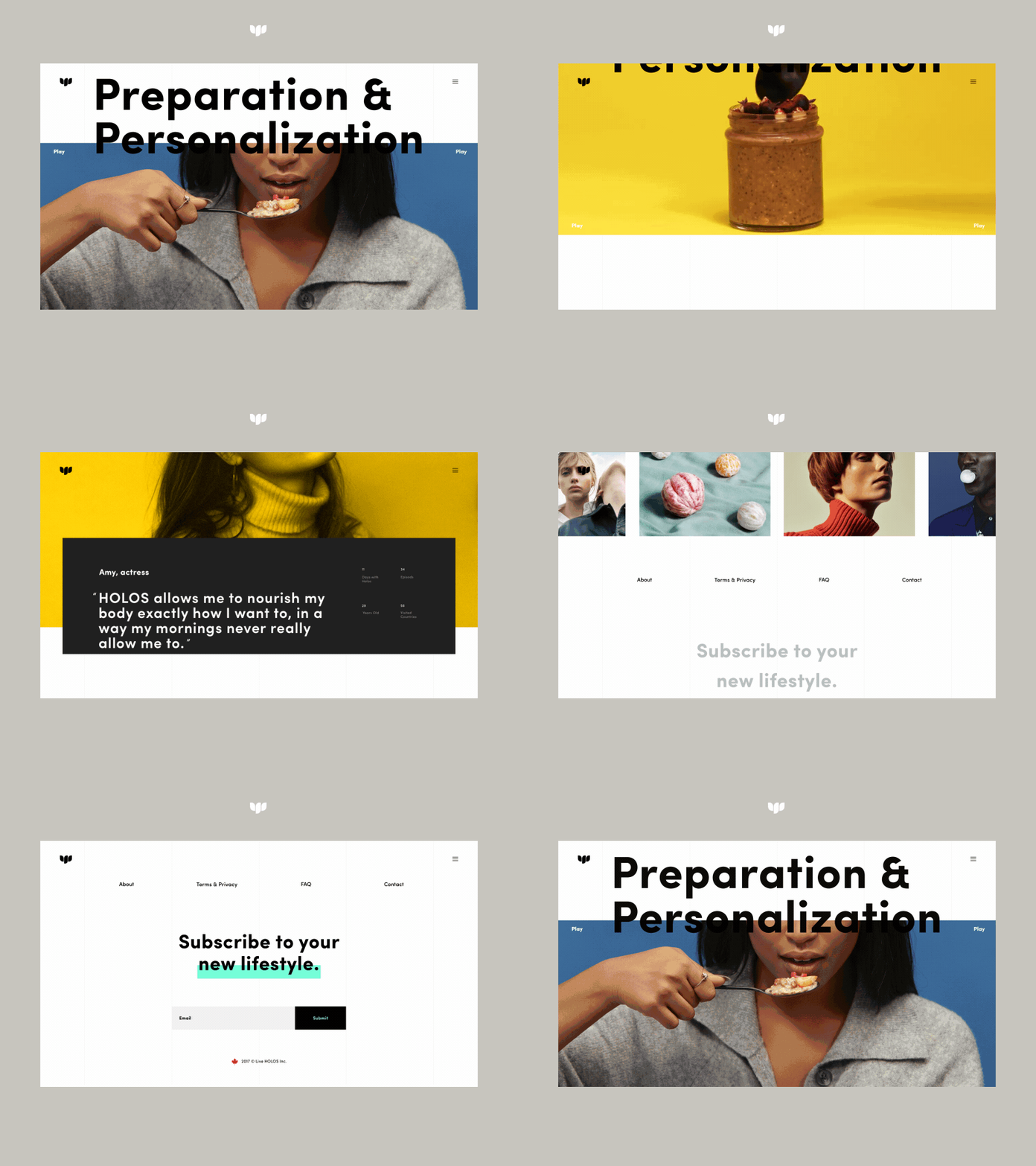
Holos Super Healthy Breakfast Promo Page Animation by Zhenya Rynzhuk for Sochnik in Holos Landing Page
Have tact
For a landing page to not have a vibe of a cheesy sale sheet, it has to represent a deeper understanding of human relationships. When writing a UX copy, I resort to one simple phrase: “Calm down.” There’s a danger in proving something to someone who’s not looking for proof. It’s not a UI/UX designer’s expose anything as well. We are not fixing the world. We are promoting the product to those who need it.
Unsolicited persuasion works in reverse.
Apple made this their gimmick:
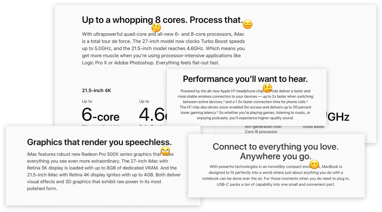
Apple addresses their clients like they are dummies. But no one hates Apple (for that). For the quality they provide, we’ll take anything. Apple can tell us how to feel about their products. Most of us can’t. In contrast, everything that has a Pro after its name is positioned in a totally different way. No “yous”, no condescendence. Clear and (not so) simple.
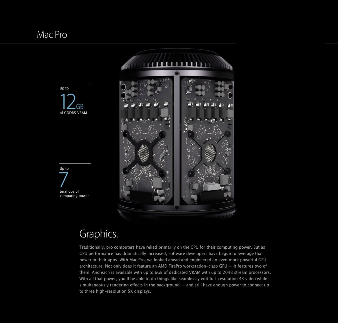
People feel when a landing page is designed for a pitch. Even done in a beautiful way, it won’t fire off if it doesn’t put a user first. When the page speaks in a calm and informative way, it exudes confidence. When it freaks out about itself, it reeks of desperation.
Nothing beats being human.
Don’t prettify
An effective landing is a photo-based page first. If it can be expressed through images, it should be. Text is supplementary for photos and it does not tell people how to feel. If text is a must-have, it should be simple with no lists or columns and fewer vector icons illustrating the points.
Frames, boxes, and blocks are noise blocking people from seeing the value that has to be expressed in the clearest way possible, again through photos and calm text. To add emotion and context, we should use real-life examples. To beat the sense of falsehood, we should be neutral in describing the product on all fronts. If the product is weak, spend the energy on making it better first.
The fact that the product is out there doesn’t mean everyone should be excited about buying it. Show value and use in something more substantial than big words. If it is disrupting, show how without using the word “disrupting”.
Any landing page can be successful depending on the severity of the need people have in that page. However it’s the designers’ superpower to squeeze delight out every page regardless of how crowded the industry is.
Do you want to create an eye-catching landing page for your website? Contact us and get a visually striking web page with a well-thought-out UX.
