The dawn of user-facing product writing
The reason why at some point it started to feel like a robot writes all things digital copy is in the history of technical and product product writing. Ever since the mid 1960’s, the terms “hypertext” and “hypermedia” had been widely used to describe a model of non-sequential writing and accessing information, stressing the connections among ideas ? This included every damn thing. Unambiguous and clear statements with no slack. Even on chocolate wraps.
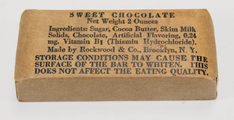
Eating quality? I mean now it has this vintage vibe which makes it kinda cool, but is this really a chocolate bar or a nutrient bar 503?
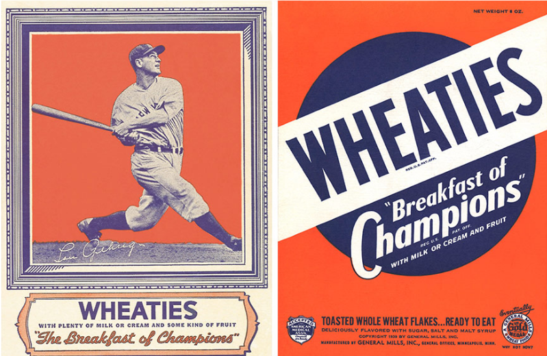
It feels like there was a distinction between the products based on what types of users they address. Obviously, a military ration was intended for a very specific user in G.I., while say, a Wheaties box was supposed to appeal to a far wider audience.
Why suspension points? Because it’s actually a person talking to you in the brand’s voice.
The text lines on the box spot the difference: “with plenty of milk or cream and some kind of fruit”. And “toasted with whole flakes… ready to eat”. That’s a vintage copy worth a thousand modern ones.
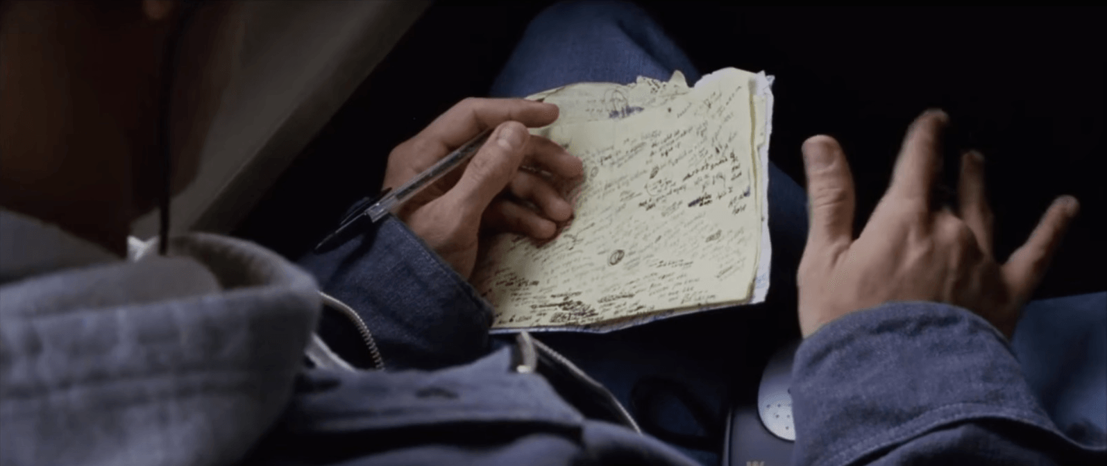
My favourite example of this historic dichotomy is the Gone With The Wind opening credits:
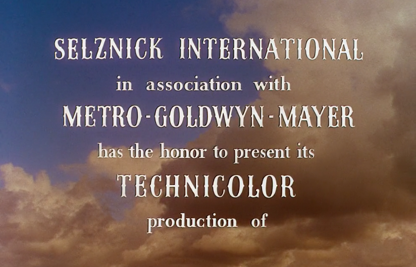
When was the last time MGM had the honor to present anything?
So since the understanding, that a user-facing product has to be personal was in place since the beginning of the last century, what was it that happened later and forced us into a robotic, androgynous, and depersonalized style of writing? It was the void that technology created by its mighty heave and which liberal arts could not bridge. Or were not allowed to. It’s staggering how much our daily technology has roots in the military.
Traditionally, the laconic language of the warfare does not intend a lot of user enlightenment and this has organically transgressed to computer interfaces.
In other words, the task—means—result logic of the military technology made its way to the daily graft. The focus on the digital tech was so huge, that it made no sense to seek empathy where there was a ton of genuine interest in the first place. That’s why early digital interfaces were so demure.
This was the time functionality was the pillar your online and digital platform would stand on. Later, functionality started to require a way to market and sell itself. This led to branding and a whole new level of online business strategy. With more similar businesses in place, entrepreneurs had to find a way to stand out. That’s how the trend of personalizing your business started.
When the voice and tone in UIs began to matter
As things kept progressing and digital experiences became less of a black sheep realm, they entered a business phase of development. All of a sudden people like Gary Vaynerchuk realized the magnitude of online entrepreneurship and embraced the chance. With that, competition came naturally.
“No matter what you do, your job is to tell your story.” — Gary Vee
Online presence became more than just an accompaniment for the actual physical business. It had to evolve to become more appealing and stand out.
Writing the UX
One of the more natural ways to do that was the design. Its visual aspect had been around for ages, but digital media gave birth to a new type of design – experience design or UX. First, it involved colors, content, typography, and the flow all of these combined would create, but later on, when everything became a bit threadbare, the change came along in form of a voice of the brand and the tone it speaks to you in.
Do you go hobnob or be super respectful? Do you play fool, or act like an upper class? Do you retain your founder’s personality for the entire brand, or do you just let it flow and be moody instead? How do you convey your message? All these are the problems someone had to take care of. And who’s better with words than writers? The late 2000’s witnessed the dawn of the UX writer’s job. It became a cross-over position for a lot of specialists, designers that are vocal, writers with an aesthetic taste, and just product visionaries who knew how to choose the right words to make it sell.
Image credit: Lauren Okura
Across the board, brands started to feel like people, exceptionally good people. Visual design coupled with texts for the benefit of the business, what else can you wish for? The new challenge came in form of a mobile screen.
The interface that was once a huge estate for you to flounder around, shrunk dramatically and cropped everything you worked for. Including the text it took you years to master.
Once you give the user a better experience, there’s no way back. Once you save them time and effort on interactions, you can’t ask them to wait anymore. Once you cut your stories short, you won’t have a chance to digress. That’s when microcopy came into play.
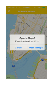
Image credit: Microcopy
Zooming in on microcopy
Generally, microcopy is any kind of a small message within the interface — tooltips, CTAs, instructions, everything that can reassure, help, delight, and convince a customer. Short text is easy to digest, it’s almost unnoticeable, and requires minimum effort to comprehend.
Large volumes of textual content are hard to grasp and need a motivated user. Microcopy is perceived as an icon or a clipart but it’s far less subjective. Like word said with a certain intonation, the correctly placed and formulated microcopy is concise and clear. So next time someone says text is useful because no one likes to read, ask them how would you graphically express this?
Image credit: Clive Jacobson
In our age of ADD and shortest attention span ever, it’s hard to argue that reading is not the most popular pastime, but that’s where microcopy shines. By refining the wording and strategically distributing microcopy through the interface, you can enhance the UX, make sure customers stay within the path, and reward them afterwards.
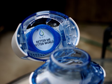
This is the message my Kor bottle gives me every time I open it. This is what a microcopy does.
There are multiple levels on which microcopy can interact with users. A simple motivational line can set them into the right mindset, a good call to action might give them just the push they’d been looking for. A reassuring statement can raise your brand’s credibility. A rewarding phrase or a joke can lower the tension and simply remind them there’s people behind this digital UI.
And this is where our natural ability to fuck it up comes into play. If there is a potential in microcopy, why not crank it to max and see what’s going to happen, right?
When things got weird
What, in fact is going to happen is the overkill of context in microcopy to the point where it becomes an inside information. This relates to the jargon used in microcopy so that it needs another microcopy to explain it.

What’s the point of this microcopy? How do I reinitialize? Do I need to go Google it? I mean how is this helpful?
What happens is writers sometimes play themselves by growing accustomed to a certain vernacular which might be off-putting to the new users.
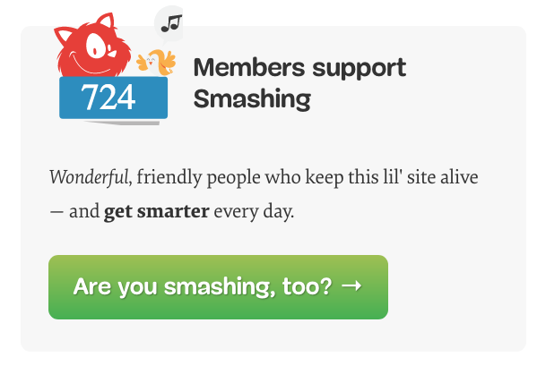
I might be smashing, but I have no idea what this means as of yet, why not onboard me first? And what’s with the “wonderful” and “get smarter”? Is it saying I’m not wonderful and smart if I’m not smashing?
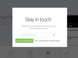
Another way to digress from the original intent is to make microcopy fix the lack of engagement the platform is clashing against.

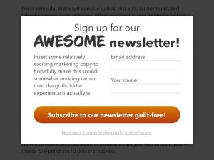
There is a special place in hell for whoever writes these “no, I don’t like money/customers/kittens” bounce buttons. A customer has to be able to opt out without being trashed.
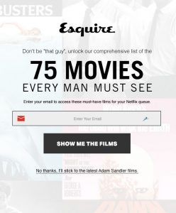
What is wrong with Adam Sandler? From Pinterest.
?
WTF?
A microcopy can suffer from even the best intentions as well. The ultra-friendly voice and tone might be cheesy if you don’t consider different variables of the situation where users face the microcopy.
Busting balls is cool, but are you sure your visitors are on the same track as you? From tinywordsmatter.

Isn’t this too much of a cartoonish joke for a software uninstall process? From tinywordsmatter.
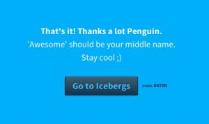
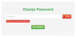
So am I Penguin Awesome? From Pinterest.
As you can probably tell, there is context to everything and microcopy alone can’t convey your entire message in a mood you intended and with a tone you meant. It has to be a cog in the wheel of UX. There are far more awesome microcopy examples out there, but they all have something in common and that’s refinement. A good microcopy is nothing more, nothing less.
How to make your microcopy sharp
- Before you as a designer think how nice it would look if you put a little subtitle in a grey italic, think of whether or not this piece of copy will be of any use.
- If the use is there, go to work and pour out a sentence or a couple. Shorten it. Check the words. Make it active, make it bold. Repeat.
- Does it leave any unclear context? What are the different situations and modalities a user might encounter your microcopy in?
- After all, these iterations, does it still feel like your brand says it? Make sure it’s not robotic, condescending, or cheesy.
- And lastly, how will it fit into the visual structure? Will it organically blend in or stand out like a graffiti? Microcopy is a part of design and so it should remain.
Here are a few of my favorite examples of microcopy done right:
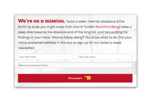
Tedium has a distinct voice and tone and “Shoryuken” fits perfectly well into it. It’s good to recognize a fellow Street Fighter fanatic every now and then.
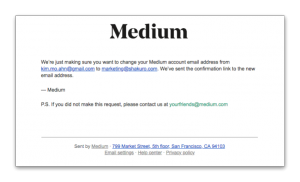
Being a fan of Medium, I feel why became one. The email you get your verification link from says it all.
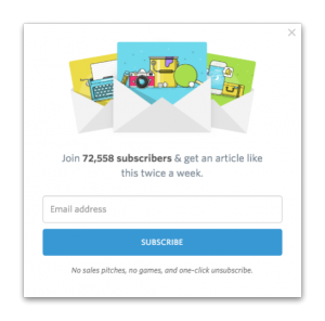
Help Scout has a great way of subscription opt in.
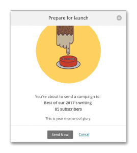
MailChimp are among the best in terms of UI/UX design of their website. The friendly voice and inspirational tone of the brand make using it an enjoyable ride …unless your campaign fails like mine.
Let me wrap up on this: designers can sometimes feel that words are only significant in the shape of a typeface they are presented in, however, if they open their mind to the power of words, and tame it, they can upgrade their design skills big time. Same way if writers like myself constantly educate themselves on the subject of user experience, they’ll be able to collaborate to the best of their abilities.

Image credit: Kim Sullivan
