Everything would be better with no interface. That’s a hard pill to swallow for designers, developers, and business owners. No interface makes your product look bodiless as if it doesn’t exist. If the product doesn’t exist, neither does your paycheck. However, an interface does not define your product because it has nothing to do with the original value that you want to bring. Your product is not the UI, in fact, the interface is what holds it back, thus the enemy.
Here, we’ll take a look into the interface design from a critical perspective, see how the importance of the interface has drawn us into a weird state of falsehood, find what and how to cut, look at the text in the interface, and get inspired by one of the most unusual modern writers in design.
Why need an interface
Not all interfaces are visible. A huge amount of operations runs through machine interfaces allowing applications to communicate with each other. There is no variations or renditions. APIs are efficient. But that’s a perfect world that does not really interest us, civilians. What we usually access are user interfaces.
A user interface (UI) is an entry point into the system. The need for such entry exists because we can’t (yet) pass commands directly into the mind of a machine. This makes an interface a two-faced Janus, smart enough to communicate the data through a numerical signal and dumb enough to understand our monkey instructions.
An interface is a desperate measure.
We are programmed to give an emotional response to whatever we are dealing with. For this very reason, interface design involves such disciplines as ergonomics and psychology. This is where a result-driven process turns into a tap dance.
yes / no
by Carolyn Figel
It’s always about the manner, not the matter. An interface aims to provide minimal input and achieve the desired output. Once you toss in optimization, the focus shifts towards the flow other than the outcome. This is where interface design shines. Sometimes at the expense of value.
UI is a shooting range for user mistakes.
According to the general systems theory, the variety on the lower levels of the organization destroys the variety on its higher levels. In other words, the more flexibility at the human input – the lesser flexibility at the system output. But system output or result is what the whole thing exists for in the first place. That’s where all the value and the money is.
This conundrum puts a hell lot of pressure on the input or the interface and adds an extra layer to the familiar discipline of UI design. On a wider scale, this is what interface and experience design is about – eradicating the weak touchpoints and limiting the amount of failure impeding people from reaching their goals.
We need interfaces to play the game, but we don’t need them to win it.
What to cut
It’s easy to abandon what is of no use. Harder to see use, especially through the lens of bias. The key to defining the real use of a product is putting a user’s need above the needs of a database, system, owner, developer, accountant, and so on. If such a need is nowhere to be found, there’s a lot of reevaluation to be done.
After we define the user’s need (pain) we are helping fix, we must consider how each and every element of the interface contributes to this fix. If it doesn’t – we should get rid of it. It’s important to distinguish the particularities of the system from those of a user.
Knowing which patterns people recognize is one thing. But forcing them to recognize your patterns is another.
User interfaces have evolved from paper documents whose goal was to gather and consolidate huge amounts of information. Any system funneling the data has to be structured. Following the path of least resistance, the system structure made its way into documents and evolved into interfaces as well.
To process the documents easier, the forms started bending the user. It worked because the need for the product was stronger than the irritation from using it. Check this out.
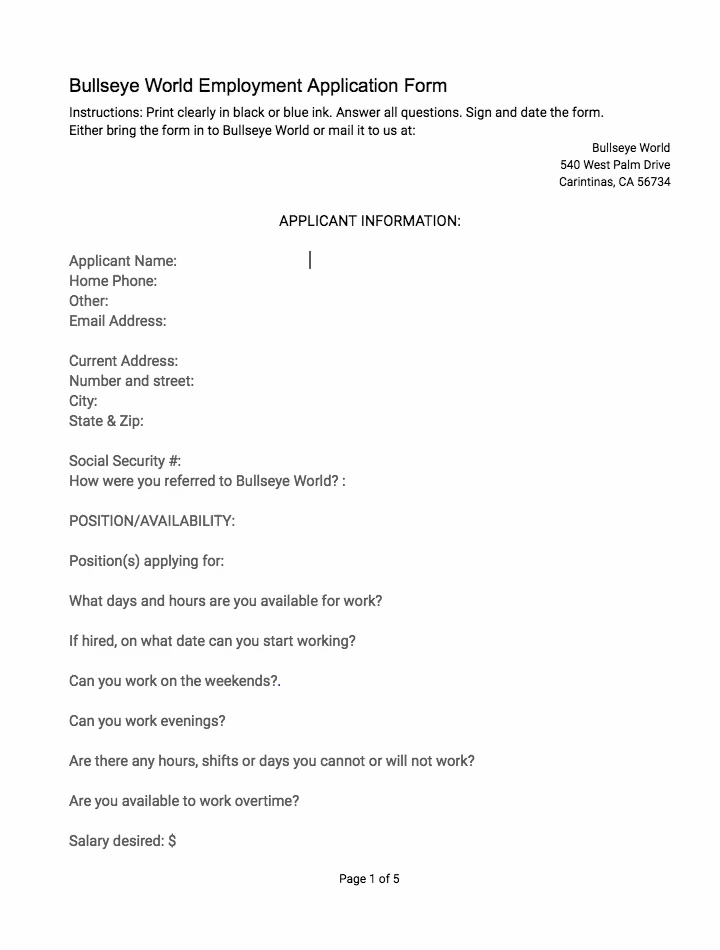
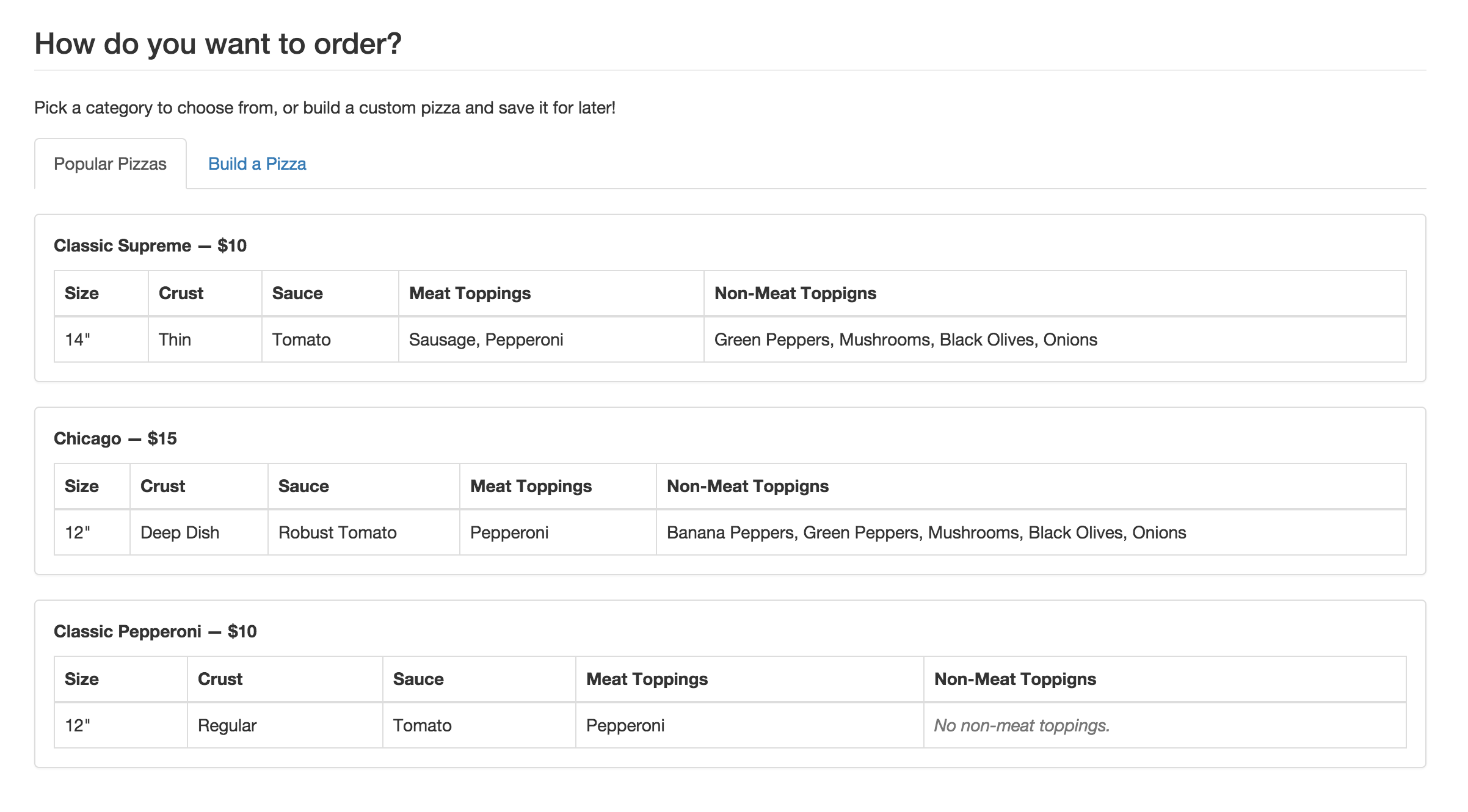
This is what a comfortable application form looks like. But it is only comfortable for the people processing it. Anyone filling it would display the same reaction. The form is made like this because it’s easier to work with. Here’s a pizza order interface:
There’s no fun filling such forms, there’s a ton of space to do wrong and zero help from the system. This is an approach that shows no care for a user and it’s a bounce machine. The system itself might be impeccable. The idea might be Samaritan but if the execution sucks, no one will ever find out about the product. This is how you abandon the UI. If there is no care, take it down.
Applying for a job does not have to feel like you are already doing the job:
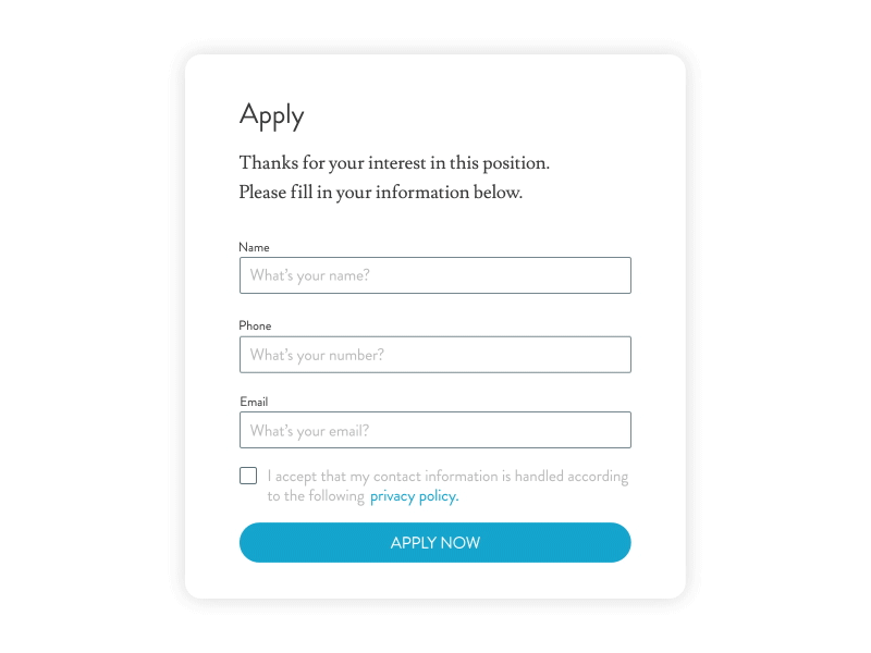
Job application modal animation
by Love Ljungström
And vice versa, ordering food should feel like you are already eating it:
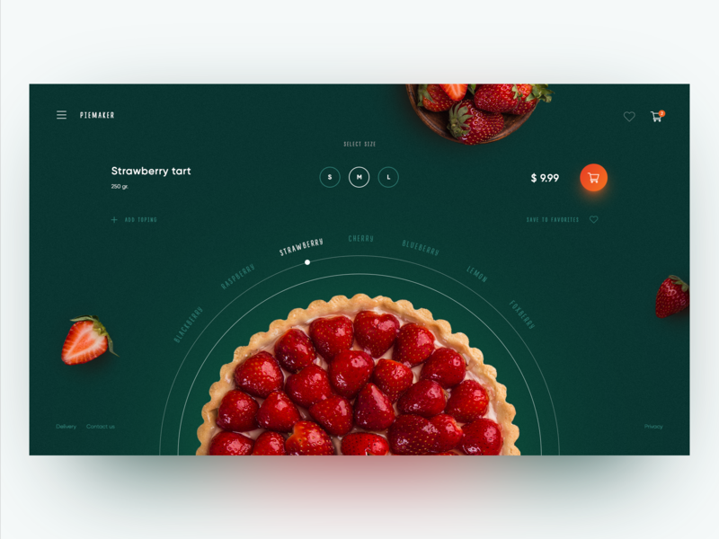
Piemaker Food Constructor Concept
by Kris Anfalova for Shakuro
This distinction comes from the crossover of functionality and beauty. On the user end, the system has to be as simple as possible. It has to be able to understand whatever comes from people and transform it into the data. Detailed UIs still feel limited while being cluttered. Minimal UIs feel almighty. Users should not be forced into constructing queries. Just let them ask questions.
This is what search engines have already implemented. The default search on Android phones and Siri will find anything you want on and off your phone without you even knowing how your question was deciphered and processed. I love how Max Bears puts it:
“Let the machine sweat.”
This means people should not adapt to the system, but the system has to mindfully understand a stressed, euphoric, drunk, sleepy, moody human.
Modern algorithms and machine learning techniques can do that. Take name fields. In different cultures and alphabets, the categories of first and last names and patronymics may differ. At the same time, there are not a lot of unique names which means a machine can find them and do the math. Whatever you need this distinction for, it’s not a user’s concern.
Björk Guðmundsdóttir
Abu Karim Muhammad al-Jamil ibn Nidal ibn Abdulaziz al-Filistini
毛泽东
María-Jose Carreño Quiñones
Kogaddu Birappa Timappa Nair
Nguyễn Tấn Dũng
These are real names which do not fit the Western paradigm. The input of these names has to be free and it’s system’s job to figure out what’s what.
Interface text
More interface – more hurdles between the customer and their money, and the business and its service. To cut the slack without losing functionality, we should eliminate a lot of text as well. For a common user, there is no separation between what the machine does and what it shows. People don’t think about the time it takes to parse and process the command. When they hit a button, they expect a reaction.
To avoid leading people astray into the system, we should cut the technical terminology out of the UI:
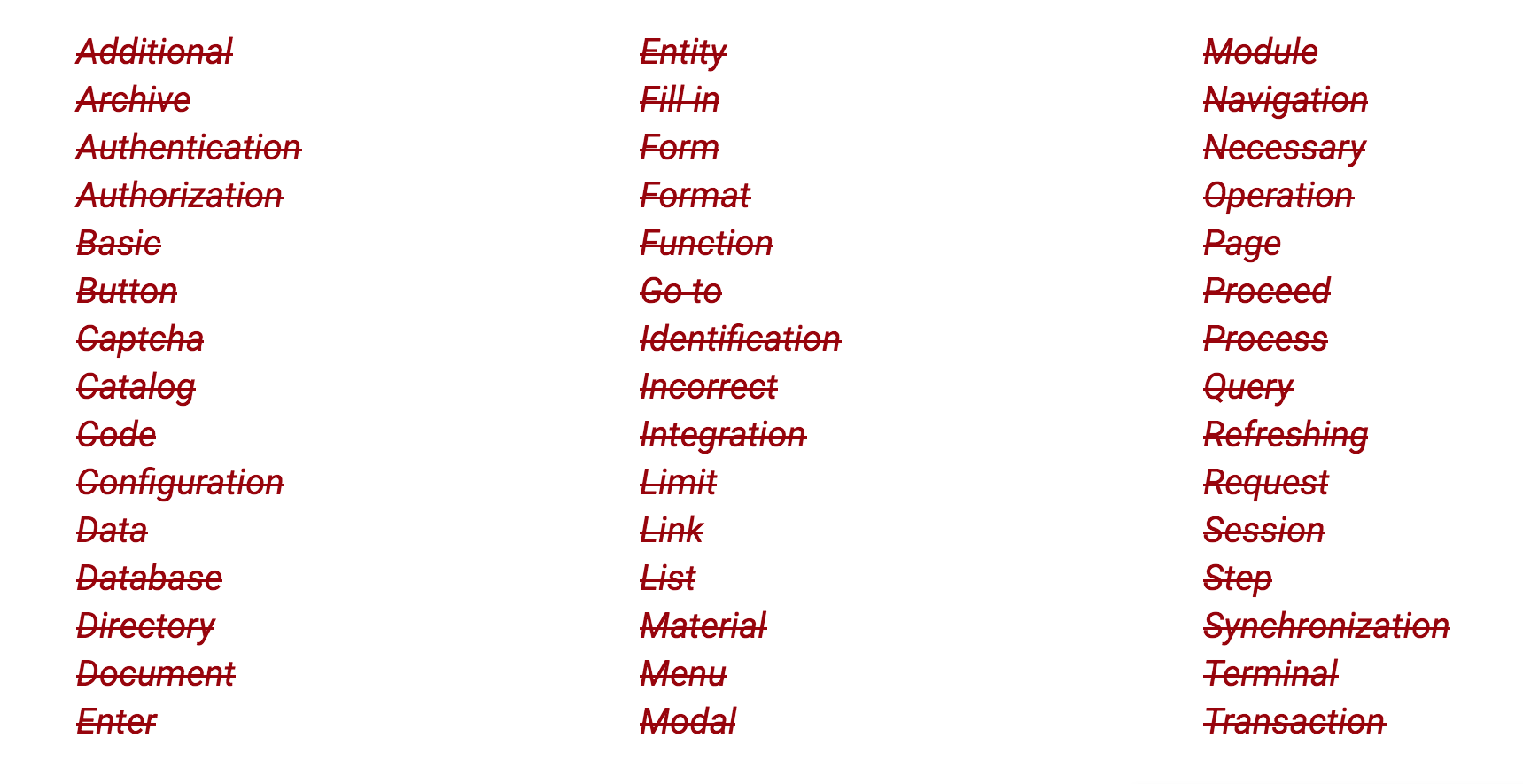
Here’s how to cut them in the UI:
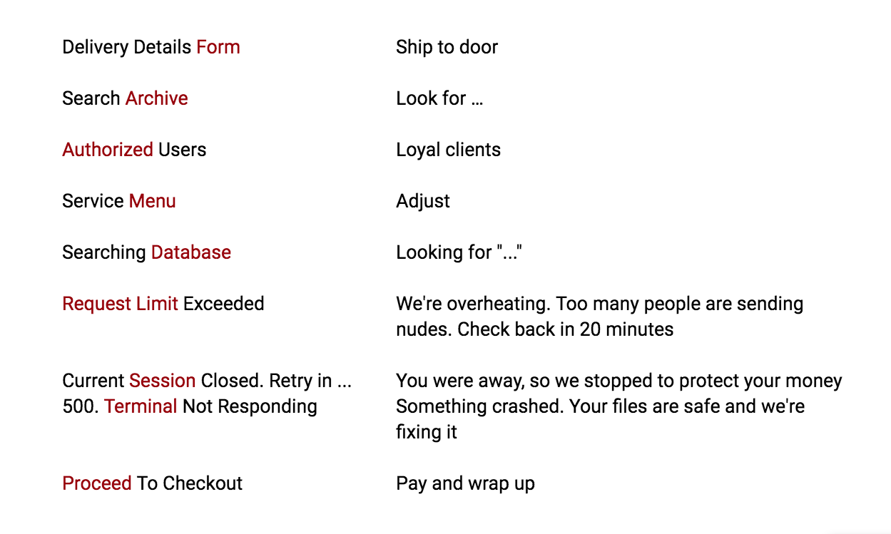
Most of these examples are obsolete and you find any of them on the websites that had UX writers combine the texts. What editing the text in the UI does, is it helps to adhere to the principles care and respect.
We love our products and we know them. That alone is a bias. This knowledge allows us to create functionality and make things work. An app might send data to the back end on another continent in a matter of seconds, yet the UI is always there in the user’s hands. Our job is to keep them unaware no matter how cool the product architecture is.
When we are using an anti-mosquito repeller, we just plug it into a socket and mosquitos can’t bite. These names alone don’t sound right but a mosquito with a huge red cross over it on the package is quite graphic. Now imagine walking into a store and seeing “Butylated hydroxytoluene” or “transfluthrin” because these are the insecticides that pass through the skin of the mosquitoes and cause paralysis making the movement of the mosquitoes slower, thus damaging their nervous system.
We’ve trained search engines to find even the most fastidious renderings of normal things. It’s not a user’s problem to make a service understand them. Naturally, a good system knows what’s up and how to really help a user. The text in the interface has to be simple and decisive. Like an action.
Don’t fight your own shadow
The design has taken interfaces from developers and made them ergonomic. UXers ran through them making interfaces a little more emotional. Then, we turned interfaces alone into a competitive realm. Pretty became a usability factor. And a digital interface became a must even where they don’t belong.
Finally, Golden Krishna wrote an outstanding book called The Best Interface Is No Interface: The Simple Path to Brilliant Technology. Golden goes way further than just cleaning up the interface and decluttering the meaning. He hilariously bashes a lot of the existing smartphone culture cliches, screen and prototype addiction, and frustration with dumb computers. Screens change behavior. And for the better. Action? Let the machine sweat. Let it learn you instead of you learning it. Automate the shit out of everything. Build bulletproof products that won’t crash in the background. I loved how Krishna figured out the three principles of design:
- Embrace Typical Processes Instead of Screens
- Leverage Computers Instead of Serving Them
- Adapt to Individuals
Finally, there are no interfaces for the things that don’t exist. And if something exists, it is there for a reason. UX does not equal UI.
Problems are not always visible on a screen.
By increasing the visual part of a product, we are taking the energy from its inner part (the one that should be sweating).
Most user tasks require an interface. Visual information digests better. This is the part designers get paid for. It is also a place for back-biting and dirty marketing. Faking value to make people click is a hell of a problem. By taking some of the visual means back, designers can save their profession from becoming a tool in the hands of politics and social movements.
It is up to us to make a change. I’ll finish with a quote:
“I believe our job as designers is to give you what you need as quickly and as elegantly as we can. Our job as designers is to take you away from technology. Our job as designers is to make you smile. To make a profit by providing you something that enhances your life in the most seamless and wonderful way possible.” – Golden Krishna
